Enhanced Visualization for Risk-Adjusted Indicators
DS
Dmitry Shevchenko08 апреля 24 г. | Опубликовано в Анонсы
We're excited to announce an enhancement to the performance indicators for portfolios and stocks. Simply looking at raw numbers doesn't always tell the whole story, so we've introduced a feature that compares these numbers to the broader market. Now, with our updated charts, you can quickly see how a particular value stacks up against other stocks or portfolios. A value in the red zone indicates it's at the market's lower end, green signifies it's in the top 25%, and yellow represents the middle ground.
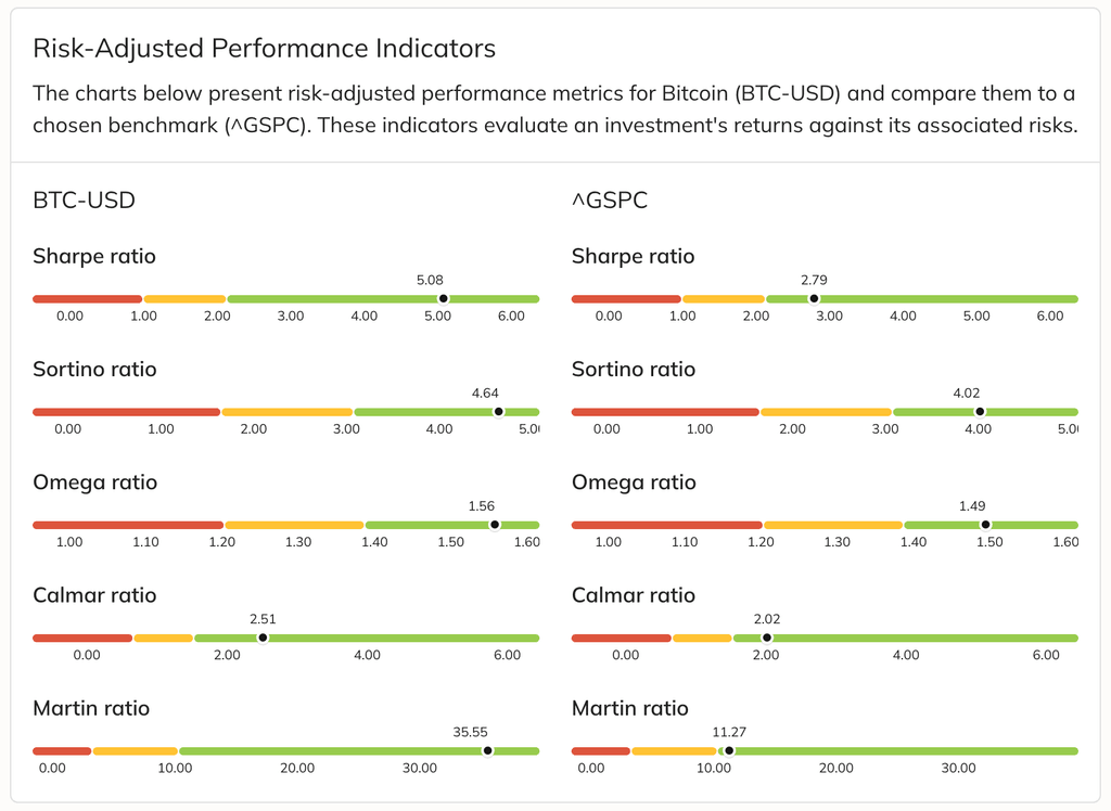
This new feature covers the five most popular risk-adjusted performance metrics: Sharpe, Sortino, Omega, Calmar, and Martin ratios, making comparisons straightforward and user-friendly.
0 комментариев
Сортировать по
Самые старые