

See What's Driving Your Portfolio Returns
Your broker shows your portfolio return, but few show where it came from. A 20% return could come from a single lucky bet or from growth spread evenly across all your holdings and that's a big difference. The same return can rest on very different foundations: broad participation across holdings, or one position explaining most of the result. We added Portfolio Growth Contribution to Portfolio Performance to show which one you're actually holding.
The new waterfall chart breaks total portfolio growth into the contribution from each holding. Positive bars add to growth, negative bars detract from it, and together they sum to the portfolio total.
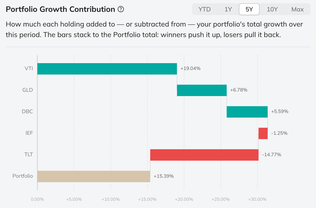
The portfolio returned +15.39% over 5Y. VTI contributed +19.04% while TLT dragged −14.77%. Without contribution, you'd never see that a single bond position nearly erased all your equity gains.
Contribution is different from a holding's standalone return. It combines a position's performance with its weight in the portfolio and accounts for drift and rebalancing. Hover over a bar to see its average allocation for the selected period. Switch between YTD, 1Y, 5Y, 10Y, and Max to see whether the drivers changed over time.
It also separates a weak holding from a real portfolio drag. A single position can plunge and barely move the result because its allocation was small; another can fall less but matter far more because it was a core holding. You see what actually moved your portfolio before making the next allocation decision.
Availability
Portfolio Growth Contribution is live now for standard portfolios in Portfolio Performance. YTD and 1Y views are available to Free users. Plus, Pro, and Max users can also compare 5Y, 10Y, and full-history results. The contribution chart supports only static portfolios at release.
0 comments
Sort by