Enhanced Visualization for Risk-Adjusted Indicators
DS
Dmitry ShevchenkoApril 08, 24 | Posted in Announcements
We're excited to announce an enhancement to the performance indicators for portfolios and stocks. Simply looking at raw numbers doesn't always tell the whole story, so we've introduced a feature that compares these numbers to the broader market. Now, with our updated charts, you can quickly see how a particular value stacks up against other stocks or portfolios. A value in the red zone indicates it's at the market's lower end, green signifies it's in the top 25%, and yellow represents the middle ground.
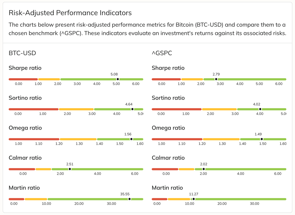
This new feature covers the five most popular risk-adjusted performance metrics: Sharpe, Sortino, Omega, Calmar, and Martin ratios, making comparisons straightforward and user-friendly.
0 comments
Sort by
Oldest